What Are the Elements of Art?
Think of art like a language. If you were writing an essay, you would use letters to form words, words to build sentences, and sentences to construct paragraphs. In the visual world, the elements of art are your vocabulary. They are
the stylistic building blocks that artists use to create a composition.
There are seven distinct elements: Line, Shape, Form, Space, Texture, Value, and Color.
When you understand how these ingredients mix, you can analyze everything from a Renaissance masterpiece to a street graffiti tag. Let’s dive in.
The Elements of Art
Line: The Foundation of Everything
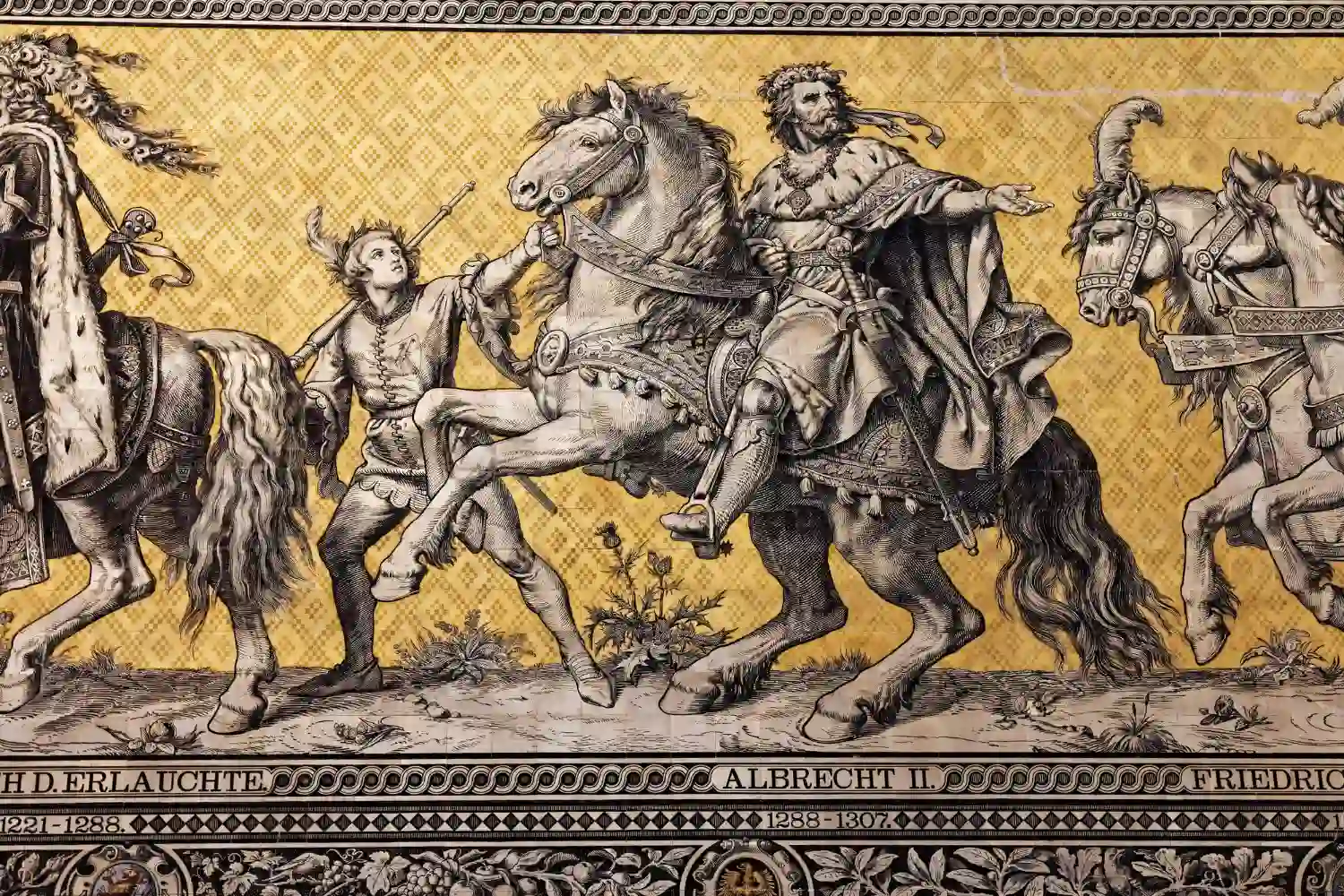
A line is often defined poetically as “a point moving in space.” It is the most basic, yet most versatile element. Lines can be two-dimensional (like a pencil mark on paper) or implied (three-dimensional).
But a line is never just a line. It carries emotion:
Vertical Lines
Vertical lines suggest stability, strength, and height (think of Greek columns or skyscrapers)
Horizontal Lines
Horizontal lines suggest rest, peace, and the horizon.
Diagonal Lines
Diagonal lines are the rebels; they scream action, movement, and instability.
Curved Lines
Curved lines offer comfort, ease, and sensual flow.
Student Tip: When analyzing a piece for class, look at “line weight.” Is the line thick and bold, or thin and delicate? A bold outline in a comic book creates a very different psychological effect than the soft, feathery
lines of an Impressionist sketch.
The Elements of Art
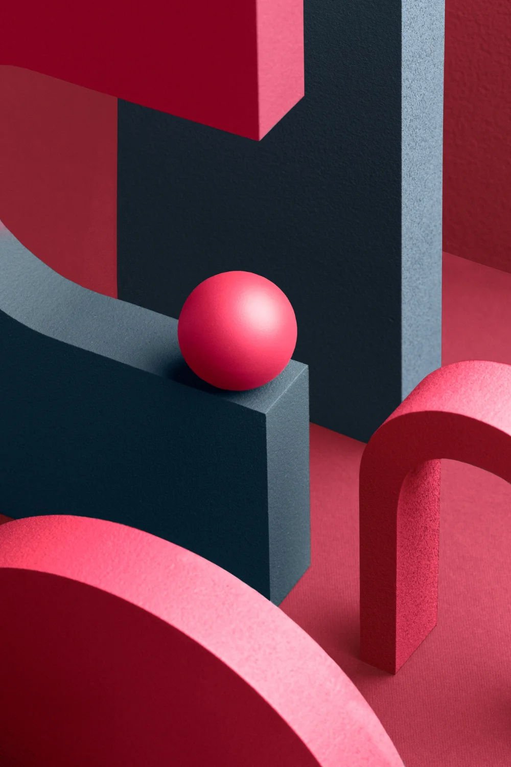
Shape: The 2D World
When a line comes back around and meets its starting point, it creates a shape. Shapes are flat; they have height and width, but no depth. Generally, we categorize them into two families:
Geometric Shapes
These are the shapes you learned in math class circles, squares, triangles. They are precise, structured, and often suggest order or human-made construction.
Organic Shapes
These are free-form and unpredictable. They mimic nature the shape of a leaf, a puddle, or a cloud. They feel more natural and chaotic.
Visual Analysis & Critical Thinking
Let’s take a quick break from the canvas to talk about something practical: your studies.
You might be wondering, “I’m studying sociology/history/literature, why do I need to know about lines and shapes?”
Here is a secret: Analyzing art is one of the best ways to train your brain for academic writing.
Many students struggle with structuring essays or thesis papers. They look at a blank page and feel overwhelmed. However, the process of breaking down a painting using the elements of art is identical to the process of Critical Thinking
required in university.
- Observation (Data Collection): You look at a painting and identify the dominant colors or shapes. This is the same as gathering sources for a research paper.
- Analysis (Processing): You ask how the jagged lines create a feeling of anxiety. This is the same as analyzing data or historical events.
- Synthesis (Argumentation): You combine these observations to form a conclusion about the artwork’s meaning.
Form: Stepping into 3D
If shape is a square, then form is a cube. Form adds the third dimension: depth.
In sculpture and architecture, form is literal you can walk around a statue or a building. In painting and drawing, form is an illusion. Artists use tricks like shading and perspective to fool your eye into thinking a flat circle is
actually a round sphere.
Key Concept: Forms can be open or closed. A “closed form” looks solid and heavy (like a rock), while an “open form” interacts with the space around it (like a skeletal structure).
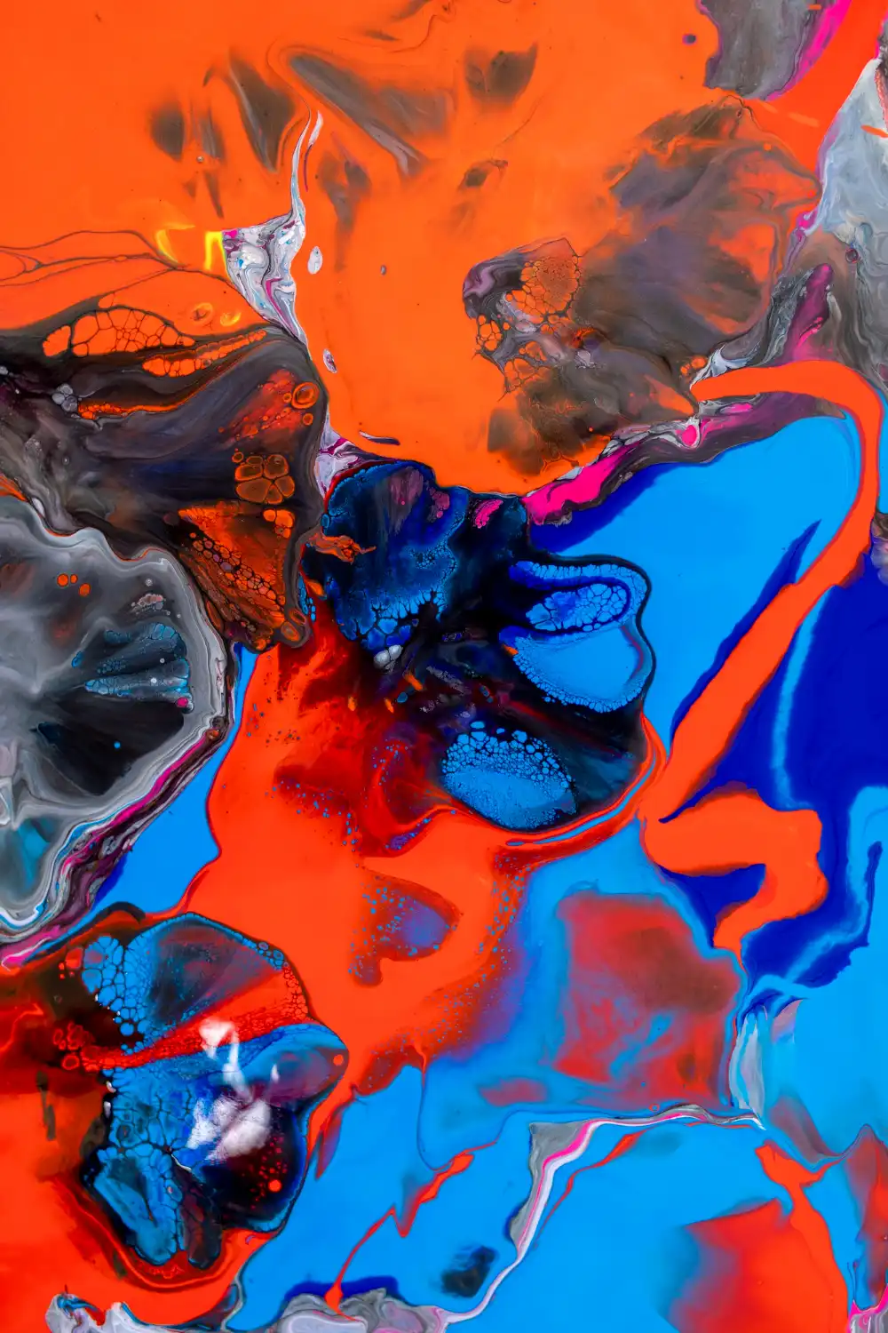
Color: The Emotion Creator
Color is the element that hits the viewer hardest and fastest. It is light reflected off objects. While color theory is a science in itself, here are the three properties you need to know:- Hue: The name of the color (e.g., “Red”, “Blue”).
- Intensity (Saturation): How bright or dull the color is. High intensity screams for attention; low intensity feels muddy or calm.
- Value: How light or dark the color is (adding white makes a tint; adding black makes a shade).
Value: The Drama of Light and Dark
Value refers to the lightness or darkness of tones or colors. You can have art without color (black and white photography, charcoal drawings), but you cannot have visual art without value. Value is what creates the illusion of light.- High Contrast: Placing very dark values next to very light values creates drama and focal points.
- Low Contrast: Using a range of middle grays creates a subtle, dreamlike, or foggy atmosphere.
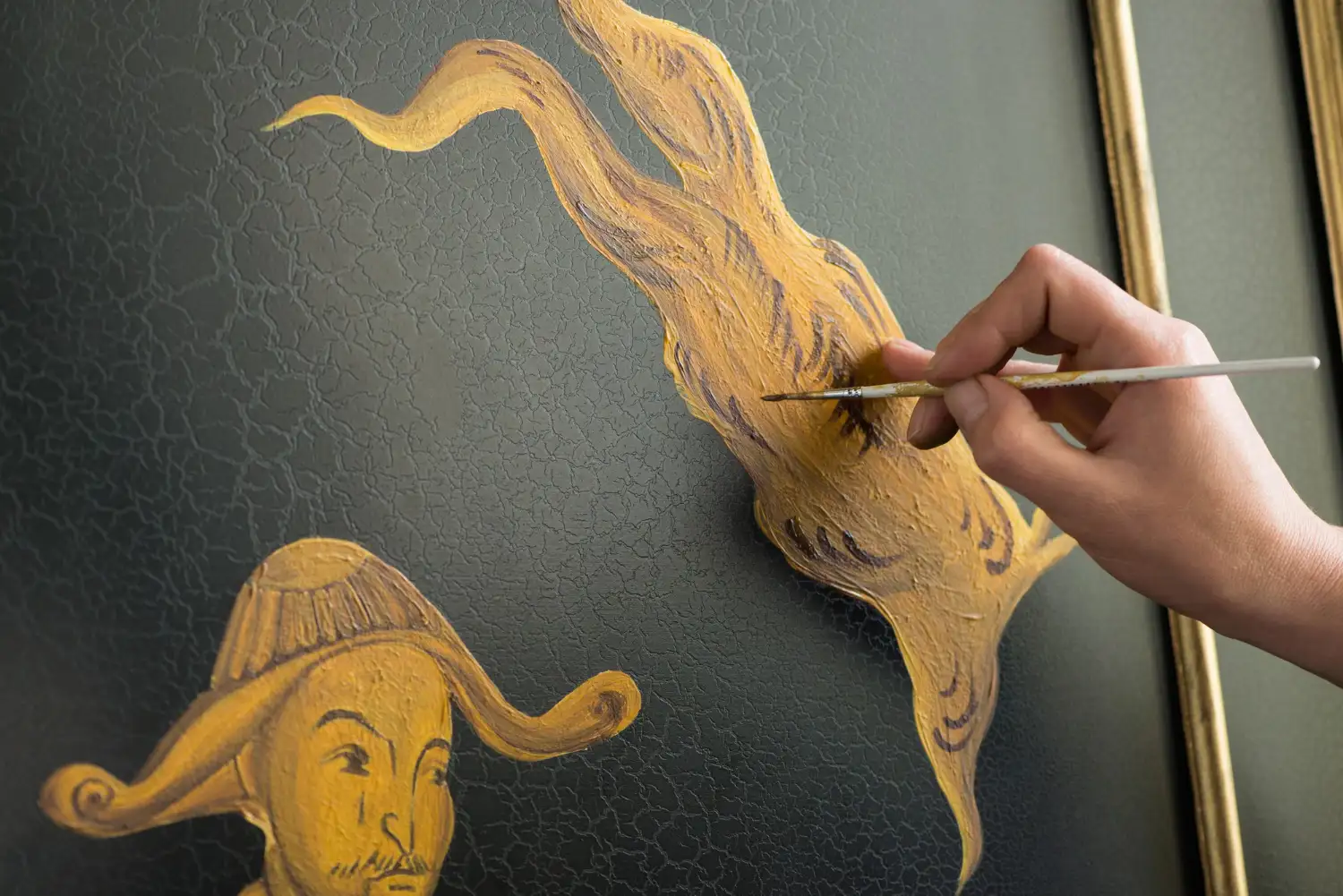
Texture: The Tactile Quality
Texture appeals to our sense of touch.
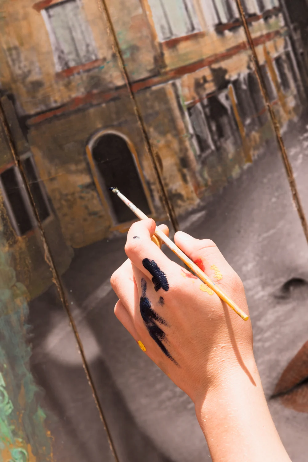
- Actual Texture: This is how something actually feels. Think of the thick, impasto brushstrokes of Van Gogh you can see the ridges of paint. Or the smooth, cold marble of a Michelangelo statue.
- Visual (Implied) Texture: This is when an artist paints a velvet dress that looks soft, or a wooden table that looks rough, but if you touched the canvas, it would be smooth.
Space: The Final Frontier
Space creates the illusion of depth on a flat surface. It is the area around, within, or between components of a piece.- Positive Space: The actual subject (e.g., the fruit in a bowl).
- Negative Space: The empty area around the subject.
Latest news from our blog
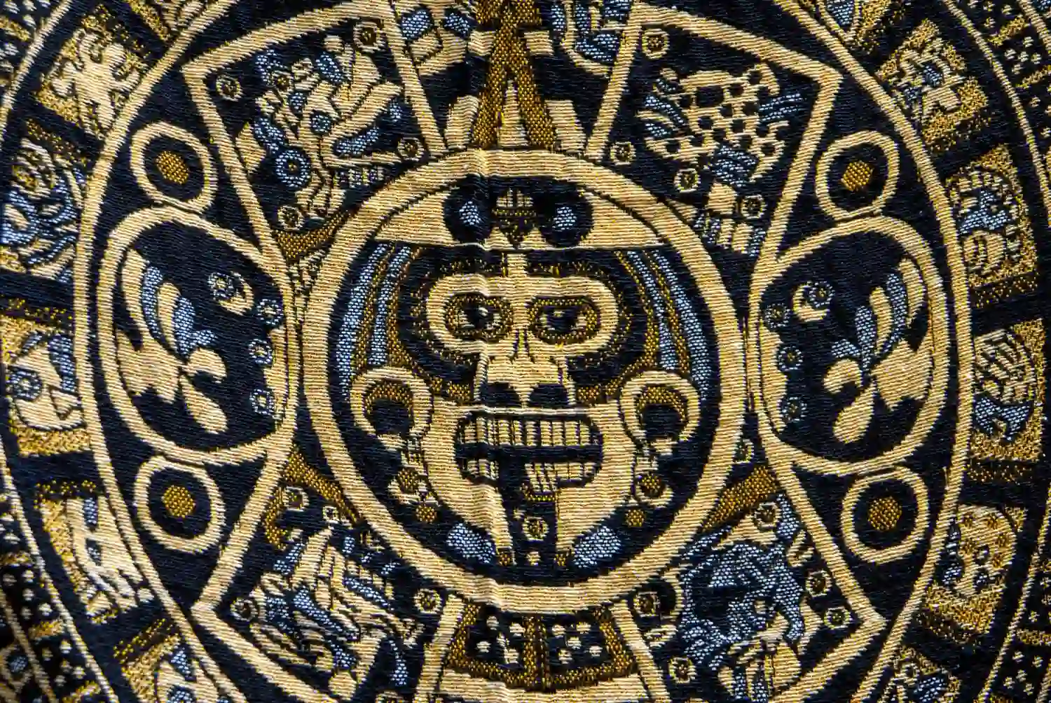
Step beyond the canvas and travel through history. From the fierce geometry of the Aztecs to the serene landscapes of Japan, discover the stories that shaped our visual world.

Why This Matters to You
Understanding the elements of art gives you X-ray vision. You stop looking at things and start looking into them.
Whether you are designing a PowerPoint slide for a university project, choosing clothes that match, or analyzing a historical monument, these principles apply. You begin to understand that design isn’t random it’s a deliberate manipulation
of line, shape, and color to make you feel something.
Here at ArtVibe, we are just getting started. Now that you have the vocabulary, we can start reading the stories. In our upcoming sections, we will explore how these elements explode onto the streets in our Graffiti Art section, discuss
practical Art Ideas for your own projects, and travel back in time through our blog to explore Japanese, Medieval, and Aztec masterpieces.
Stay curious, keep observing, and let the art vibe resonate with you.
These services where you can pay someone to do my physics homework DoMyEssay help manage academic workload by delivering essays written from scratch for each assignment.
Writing support platforms like https://payresearchpaper.com/
provide tailored academic solutions for learners who need help developing clear, well-researched papers.
This website is for educational and informational purposes only. No commercial use intended.